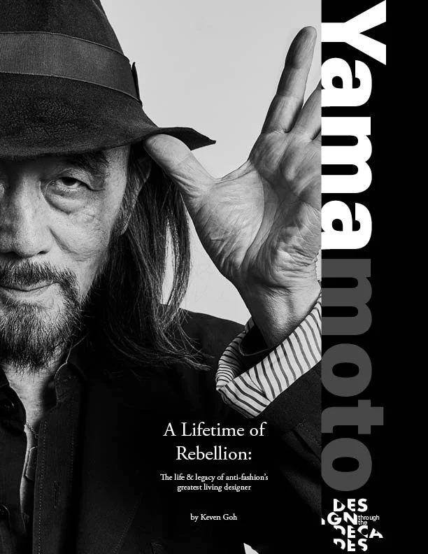
Yohji Yamamoto: A Lifetime of Rebellion
Overview:
Project Type: Print & Editorial Design
Course: GIT 540
Tools Used: Adobe Illustrator; Adobe InDesign; Field Notes A6; rOtring 600 0.5mm
Duration: Two weeks
Role: Researcher; Designer; Author
Summary: I was tasked with designing an 18-page editorial layout for an upcoming installment in Professor Cameron Rennacker’s Design Through The Decades academic journal, based around an academic paper I previously composed examining the career of renowned fashion designer Yohji Yamamoto and his influence on the world of fashion design; particularly his pioneering influence on the ‘anti-fashion’ movement that emerged in the late 20th century. The project iinvolved developing a visual language for the article that reflected Yamamoto’s severe, deconstructed design sensibilities while also maintaining a high level of legibility and aesthetic cohesion.
Problem Definition:
Adapting the aesthetics of Yamamoto’s expansive fashion design repertoire into the comparatively more restrictive medium of print design served as the central design challenge throughout this project.
Initially, I tried to replicate Yamamoto’s design language as directly as possible, before repeated ideation led to my arrival at an iteration of digital brutalism combined with Yamamoto’s distinct color palette to capture his deconstructed, severe aesthetic.
Research & Discovery:
First, I conducted research into Yamamoto's own work. Seminal works such as 1977’s Y’s and 2003’s Y-3 demonstrated Yamamoto's penchant for stark, deconstructed minimalism set against a monochrome black color palette. This research subsequently informed my initial selection of typefaces— bold, sans-serif fonts were selected for their modern, imposing appeal, while a variety of classic, serifed fonts were chosen for their classically refined feel for contrast.
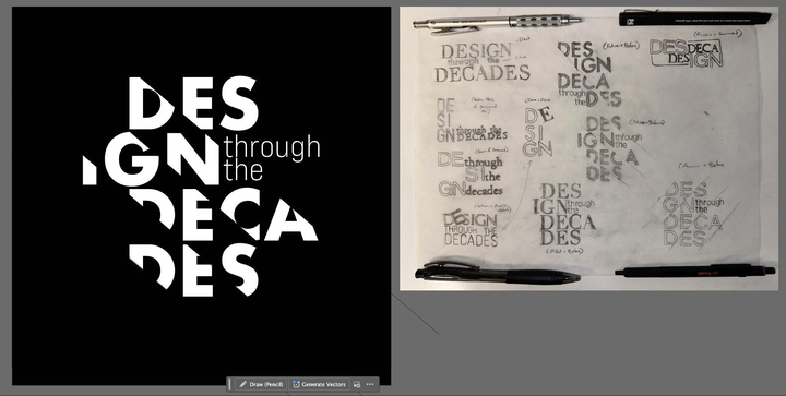
These typefaces were aggregated in Adobe InDesign and printed onto stock paper. Using tracing paper, I then composed a variety of logos by exploring different typeface pairings, text layouts, and distortions through adding or subtracting hand-drawn elements from the text. To supplement this iteration, I conducted research into the design language of fashion magazines that Yamamoto’s work sees coverage in, from the wildly popular Vogue to the more avant-garde focused System.
Once the logo was approved by the stakeholders, I then expanded my research to draw further inspiration from aforementioned fashion magazines, paying particular attention to layout, hierarchy, and how different issues adapted to the artists/designers they were highlighting.
Solution & Value Proposition:
The final product was an 18-page, print-ready editorial layout for the Yamamoto article. A stark, brutalist design language was chosen to reflect Yamamoto’s penchant for deconstruction and asymmetry in his garment design. The layouts were complemented by custom illustrations and geometric iconography, and text scaling was set up to harmonize with the placement of visuals while retaining their legibility.
Ideation & Concept Development:
A wide variety of iterations were tested for the design of the cover, which would be the first thing seen by readers and therefore necessitated a high degree of attention. Using a set of font pairings I had developed early on in the project, I experimented with various different designs to evaluate for visual hierarchy, cohesion, and flow.
Prototyping & Refinement:
Each iteration of the full print layout was developed to a mid-fidelity level using Adobe InDesign, and improved based on peer and stakeholder feedback. Primary implemented feedback included fine-tuning the placement of images so not to overwhelm the the text, maintaining a balanced feel by not going overboard on the brutalist asymmetry, and adjusting font scales for better legibility.
Results & Impact:
The final iteration received stakeholder approval and was accepted for publication to the Design Through the Decades academic journal. As a result of repeated iteration and external input, the end result effectively synthesized Yamamoto’s sensibilities and aesthetic in fashion design with the print medium.
Key Takeaways:
Translating a design language across mediums requires adaptation rather than direct replication—what works in fashion doesn't always translate literally to print
Analog ideation methods (tracing paper sketches, printed typeface experimentation) can be invaluable for exploring digital design problems, especially when working with deconstructed aesthetics
Brutalism as a design approach requires careful balance—pushing boundaries while maintaining usability and legibility
Stakeholder and peer feedback was essential in preventing the design from becoming too experimental at the expense of readability
Reflection & Next Steps:
The project reinforced the importance of extensive research into both the subject matter and the medium—understanding fashion editorial design was as crucial as understanding Yamamoto's work
Moving forward, I'd like to apply this methodology of analog-to-digital iteration to other cross-medium design challenges, particularly when translating unconventional or avant-garde aesthetics into functional layouts