Design Through the Decades: Yohji Yamamoto
An 18-page editorial layout translating one of fashion's most uncompromising aesthetics into print — without losing what makes it dangerous.
Overview
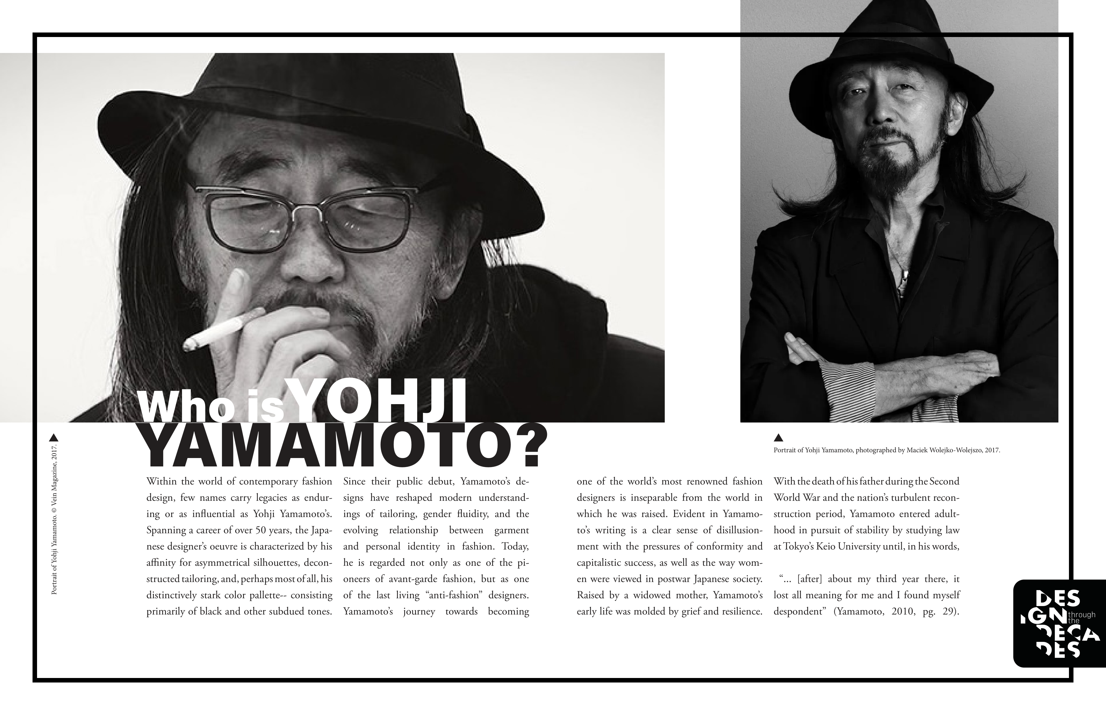
Professor Cameron Rennacker's Design Through the Decades is an academic journal examining the careers of influential designers across history. I was commissioned to design the Yamamoto installment — an 18-page, print-ready editorial layout built around an academic paper I had previously written on Yamamoto's career and his foundational role in the anti-fashion movement of the late 20th century.
The challenge wasn't writing about Yamamoto. It was designing for him.
The Problem
Yohji Yamamoto's work is defined by deconstruction, asymmetry, and a severe monochrome palette. His garments reject conventional beauty in favor of something more unsettling and more honest. Translating that sensibility into print editorial design — a medium with its own conventions around hierarchy, legibility, and flow — was the central tension of the project.
Research
Before touching InDesign, I went deep into two parallel research tracks.
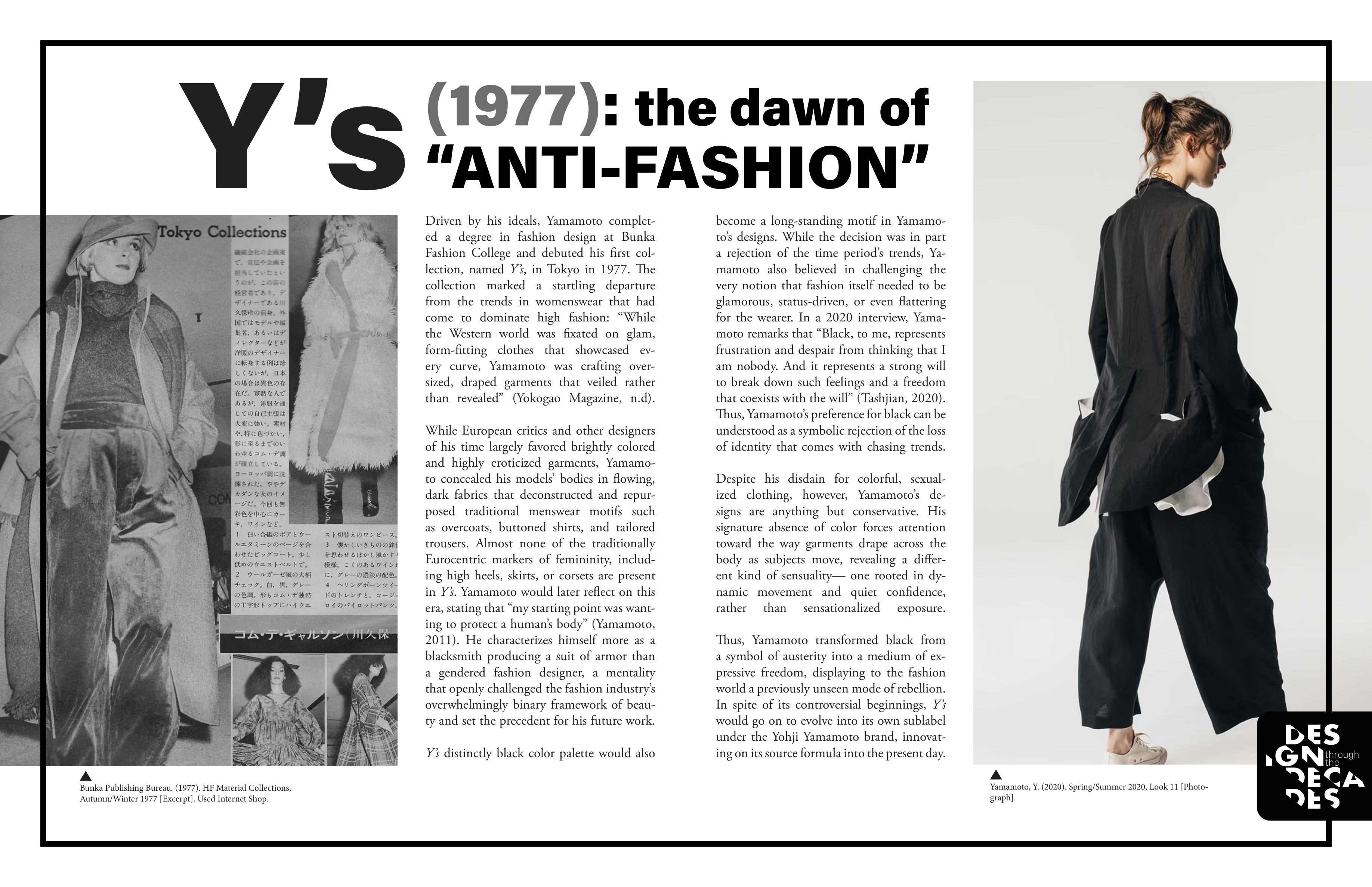
The first was Yamamoto himself. Seminal collections — 1977's Y's, the 2003 Y-3 collaboration with Adidas — established his visual language: stark, deconstructed, monochrome, severe. This informed early typeface decisions. Bold sans-serifs for their modern, imposing weight; classic serifs for contrast and the refined tension Yamamoto creates between elegance and subversion.
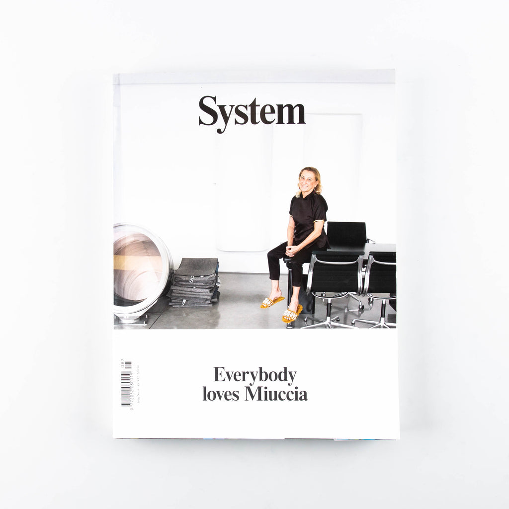
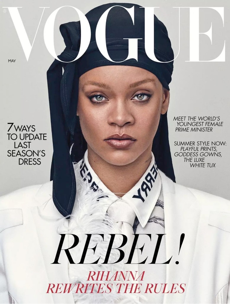
The second was fashion editorial design. I studied the magazines that cover Yamamoto's work — from Vogue at the mainstream end to the more avant-garde System — paying close attention to layout, hierarchy, and how each publication adapted its visual language to the designer it was featuring. No two issues of System look the same. That adaptability was the lesson.
The Pivot
Direct replication failed. Yamamoto's aesthetic works in three dimensions, in motion, on a body. Flattened onto a page it read as imitation rather than translation — a costume rather than a language.
The breakthrough was reframing the problem. Instead of asking what does Yamamoto look like, I asked what does Yamamoto feel like — and the answer was digital brutalism. Raw, structural, deliberately uncomfortable. Combined with Yamamoto's monochrome palette, it captured the deconstructed severity of his work without pretending to be something it wasn't.
Analog Process
The logo development happened almost entirely by hand. Typefaces were printed onto stock paper, then traced and distorted — adding and subtracting hand-drawn elements, exploring pairings and layouts through physical iteration before touching a screen. The rOtring 600 and Field Notes A6 were the primary tools at this stage.
There's something appropriate about using analog methods to design for a man who built a career on the handmade and the imperfect.
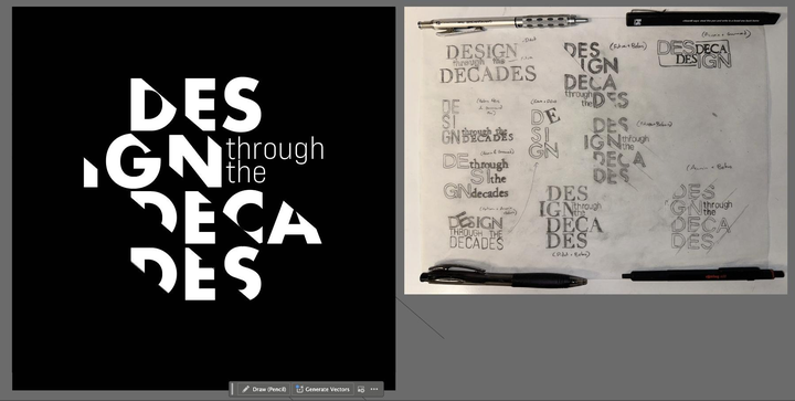
Once a direction emerged from the sketches, the logo was brought into Illustrator, refined, and presented to stakeholders for approval before the layout work began.
Layout & Refinement
Each iteration of the full layout was developed to mid-fidelity in InDesign and reviewed through rounds of peer and stakeholder feedback. Three themes emerged consistently:
Image placement — early layouts let the visuals dominate at the expense of the text. Feedback pushed toward a more deliberate balance where images and copy reinforced each other rather than competed.
Brutalism with restraint — the asymmetry needed to feel intentional, not chaotic. Pushing too far lost the legibility that makes editorial design functional. The final layouts walk the line deliberately.
Typographic legibility — font scales were adjusted across multiple rounds to ensure the brutalist aesthetic didn't come at the cost of readability. Yamamoto's work is challenging, but it's never inaccessible.
Result
The final product was an 18-page, print-ready editorial layout accepted for publication in Design Through the Decades. The brutalist visual language synthesized Yamamoto's deconstructed aesthetic with the demands of the print medium — severe without being illegible, experimental without being self-indulgent.
Takeaways
Translating a design language across mediums requires adaptation, not replication. What works in fashion — in three dimensions, in motion, on a body — doesn't flatten directly onto a page. The analog-to-digital iteration process proved essential: the best ideas in this project came from tracing paper, not a screen.
And stakeholder feedback, taken seriously, is what prevented the design from disappearing into its own experiment.